Color Description Tag


Academic Project
Designed a physical shopping tag for accessible user experiences
DURATION
10 weeks
ROLE
UI/UX Designer & Researcher
TOOLS
Figma, FigJam
Background
Through the lens of empathy, we envision a world where individuals with visual impairments experience a sense of empowerment and inclusion. Our journey into the project for the visually impaired is rooted in a deep well of empathy and a genuine desire to make a meaningful impact on the lives of those facing visual challenges. The motivation behind this project stems from our recognition of the unique struggles that individuals with visual impairments encounter daily. We believe that everyone, regardless of their abilities, deserves access to opportunities that enhance their quality of life.
Problem
Facilitating independent and empowering shopping experiences for individuals with visual impairments in clothing stores poses a challenge. The objective is to conceptualize and develop a comprehensive tool or system that serves as a guiding and informative companion, enabling individuals with visual impairments to navigate clothing stores autonomously and with confidence.
Design Process
We followed the following design process and it was iterative in nature:

User Research
LITERATURE REVIEW
We researched 5+ research papers to get an idea of the problem area to concentrate on.
We researched in the following areas:
-
Color-coordination for blind users
-
Recognizing the colors
-
Latest technology used to help them
-
Existing Apps and solutions available in the market and review
ASSUMPTIONS
-
Blind people want to go out shopping for clothes on their own.
-
Online shopping is easy because blind people do not have to go out themselves.
-
Blind people read only brail text
RESEARCH FINDINGS
-
Blind people love the company of their loved one and often choose to go out shopping with a trusted person.
-
Online shopping websites have accessibility issues which frustrates blind people.
-
Blind people can very well read raised text letters in English
USER INTERVIEWS
We interviewed 5 legally blind users - all women. We got a high participation interest from women. All were interviewed via Zoom.
COMPETITOR ANALSYS

AFFINITY MAPPING
We grouped all the findings from all sources and started looking at themes.

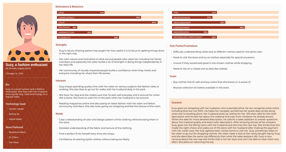
USER PERSONAS
After knowing that we have a companion with our blind user, we came up with two user personas
USER JOURNEY MAP
We created two user journey maps, one for the blind user and the other for their companion. It shows a clear interpretation of our user research.
Key Findings
-
Colors are difficult to discern if it’s not descriptive; will have to Google color description
-
Preference for solids
-
Color identifiers are not always accurate and not user friendly; apps exist but not reliable
-
Patterns - need to feel; difficult to make decision on the structure of the patterns - going to the store is preferable
PROBLEM STATEMENT
How might we help visually impaired users to know more about the fabric they plan to buy in a store in so that it helps them to make a buying decision?
Design
STORYBOARD

CONCEPT DIAGRAM
The following concept diagram shows key features in the tag system:

IDEATION
As a team, we came up with ideas to find solutions to the found problems.

PHYSICAL TAG EXPERIMENTATION
We tried different approaches considering context of use and the material that might be most suitable for such a tag.
1. Acrylic tag (created with laser cutting process)


Pros:
1. Braille + English text
2. QR code that is engraved
3. Light weight
4. Big enough to find and hold it
Cons:
1. Engraved Brail
2. Small size of brail text
3. Can be difficult to hold phone on the QR code for the blind user alone
2. Leather Tag

Pros:
-
Big raised letters are easy to read
-
Light weight
Cons:
-
Easy to miss out as it might be same as an apparel
-
Not compatible, might be maintenance
3. NFC Tag


NFC Enabled
Retains info that a store needs
Similar in size and weight to a regular store card
Out of all explorations, the NFC tag seemed to have a better way of benefitting with scan ability (as no precision is needed to scan using NFC) as well as discoverability.

UI DESIGN
As we planned on having an interface for the companion to help our blind user, we created lo-fi designs on how the interface would look like that stores personal information, tag scan history and much more.
Create a profile
Scanned Items
Browsing scanned items

.png)

Evaluate
We got a chance to evaluate our first prototype, the acrylic tag with one blind user.

MAJOR FINDINGS
-
Raised letters are something she was used to reading
-
Braille should be bigger and tactile, if used
-
Difficult to locate camera on the phone on the QR code location, most blind people have never used a their camera app
-
Uses built in iPhone VoiceOver accessibility tool for screen reading
-
Focus: Size, Color, Price, and Fabric
Key Learnings
-
Verifying our assumptions is very important as a researcher and as a designer.
-
The hypothesis of literature review can be contradicting or different from real time user research.


