EdTech
Revamped a difficult to use study portal with easy to navigate and real time information with a satisfaction rate of 70%
DURATION
10 weeks
ROLE
UI/UX Designer & Researcher
TOOLS
Figma, Miro, GoogleDocs
COLLABORATION
Business stakeholders, product managers, business analysts, engineering lead, developers & UX lead
Background
D2L is an online portal for students at DePaul and some other US universities used to keep up with student’s coursework, course lectures and manage submission deadlines.
Design Process

User Research & Problem Discovery
DOMAIN OF INQUIRY
Our domain of inquiry focused on the area broadly concerning DePaul students and their experience using the existing D2L portal. We started by considering students with various backgrounds and at different levels in the grad and undergrad school.
USER INTERVIEWS
Our area of inquiry concerned the following:
-
Most used features of D2L.
-
Challenging sections to access in D2L and how users get through it.
-
Contextual inquiry to verify how users access the sections: Content, Discussion, and submission.
-
Communication between students and professors during and after classes.
-
Tracking of submission deadlines.
Affinity mapping or clustering was helpful for us to sort and categorize our sets of
data. It helped us form patterns, draw commonalities and better understand the correlation between insights, as pictured below.

KEY FINDINGS FROM USER INTERVIEWS

Many sections of the site are undiscoverable
Task completion and navigation are time-consuming and confusing
Text-heavy sections increase cognitive load
External platforms, such as Discord helps in keeping up with coursework and deadlines
Structure of course content on the student-facing interface of D2L varies from professor to professor
Inconsistent and unreliable notification system
HEURISTIC EVALUATION
We did a light heuristic evaluation of D2L. This helped us get an assurance of some problem areas and helped us point out specific issues. Here are some of the major usability issues captured:
Click to enlarge
PERSONAS
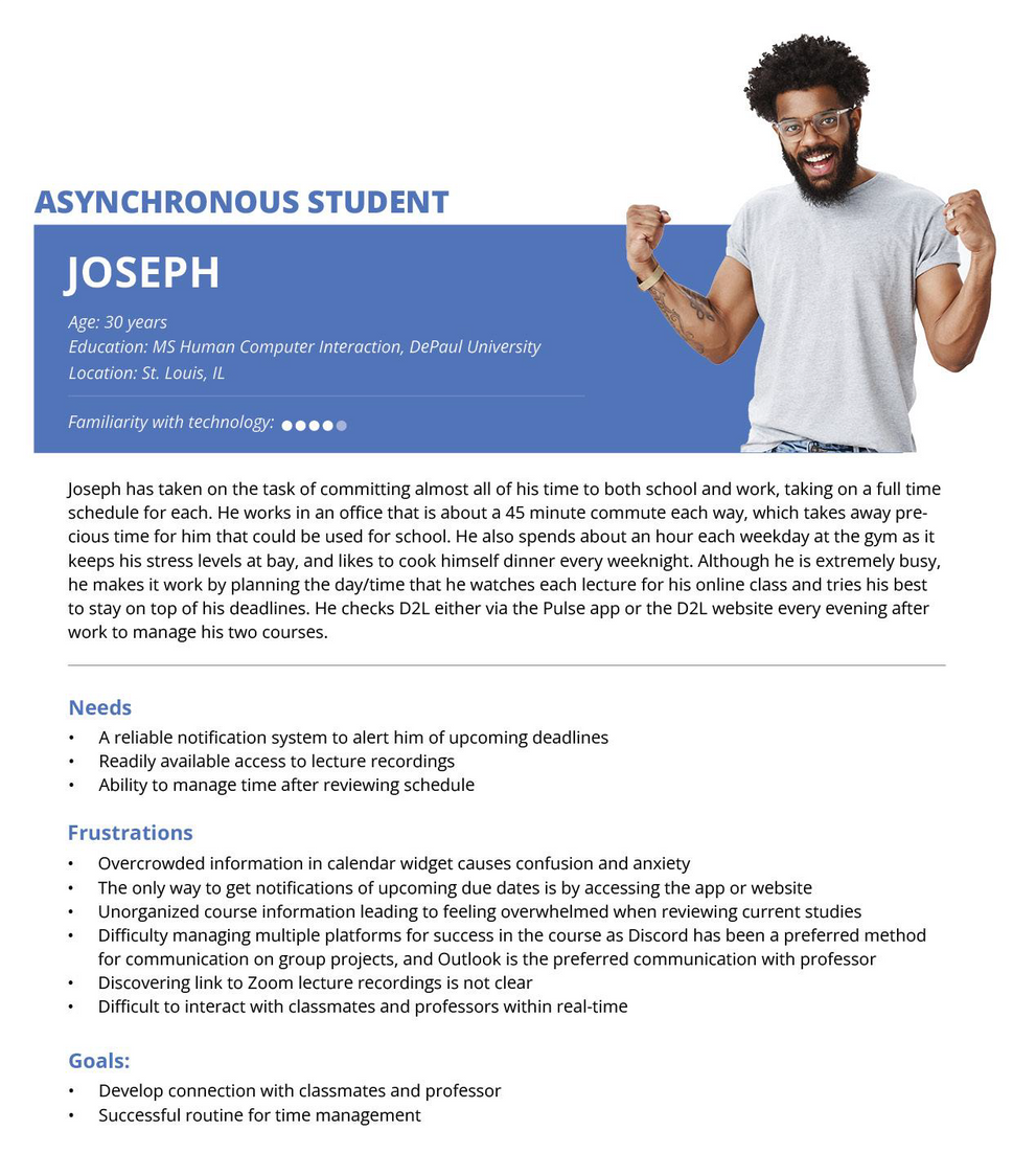
After collecting findings, it was time to form a picture of how our users would be using D2L currently. We created two personas: one was a full-time employee and the other was a new mom.
PROBLEM STATEMENT
How might we make D2L easy to use so that students find it easy to navigate throughout the website?
Conceptual Design
REVISITNG PERSONAS AND CREATING SOLUTION SCENARIOS
We revisited our previous personas and our problem areas to create scenarios that depicted the actual scenarios.
These two scenarios covered major problem areas including situations with family and disconnect with professors while being a student at DePaul.
Joseph's Scenario

Hannah's Scenario

REQUIREMENTS
After defining our problem areas, our next step was to gather the requirements for our potential design solutions. The first step in creating requirements was to club related points together to form clusters and thereafter, create concepts to redesign the D2L platform.

Interaction Design
INFORMATION ARCHITECTURE
The next step in creating our wireframes was to create an information architecture to define the hierarchy and structure of our website. We created a site map by combining the options on the menu if they were repetitive and restructuring the options to create a more intuitive architecture.

Hi-Fi PROTOTYPE
Accessing the assignments

Accessing chat feature

Evaluation
EVALUATION STRATEGY
We tested the solution with 4 users online vis Zoom and they performed 3 tasks each.
-
First click testing: Failure to click in the right place first, or taking a long time to click there, suggests that something is wrong with the site's layout.
-
Task Analysis: We used task analysis to understand how our participants go about achieving the goal of the activity, and how effective and efficient it is.

EVALUATION FINDINGS
-
7 out of 8 participants mentioned that they found the ‘Upcoming’ section on the right panel useful for navigating the website.
-
Number of clicks were reduced by 70%.
-
2 out of 8 participants did not initially notice the redesigned section.
-
2 out of 8 participants recognized the use of the shortcut to newly released grade from the Homepage.
-
3 out of 8 participants recognized the chat icon at the top bar of the Homepage as a discussion icon due to the earlier mental model of users about D2L.
Key Learnings
-
Understanding of how someone's personal life might affect their way of interacting with an online everyday go-to place is something interesting that I would definitely take-away from this project for my future projects.
-
Identified that the persona which was not in our scope - the professors who customize D2L. It would be an interesting area to explore and improve for a particular university to make the user experience consistent across the two user groups.


